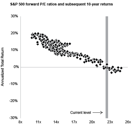
Interesting graph I ran across in a newsletter that stole it from JPM Wealth Management.
It graphs the 10 year returns after the S&P at various Forward PE levels.
I'm a homer douche about the S&P500. Maybe I should be less. Problem is I'm guessing if I get too crazy, I'll have trouble outperforming the S&P materially, so maybe the answer is keeping a little bigger cash position or *gasp* bonds. (I fucking hate bonds).
Anyway, it may mean nothing, but zooming out I think has value.
Newsletter I got it from - not particularly valuable, but full disclosure.
This week I set up Actual Budget for budgeting and tracking my investments. It's an open source alternative to YNAB or Mint. It's free so I only pay $1.50/month for the real time transaction API. I'm liking it so far. [Reply]
Originally Posted by UteChief:
I don’t think that’s what free means.
Pretty affordable, though. I spend $120/year on Quicken. (Granted, that also includes some invoicing features that my wife uses for her consulting work.) [Reply]
Originally Posted by DaFace:
Pretty affordable, though. I spend $120/year on Quicken. (Granted, that also includes some invoicing features that my wife uses for her consulting work.)
Originally Posted by RunKC:
I have 10k on the bench and am considering buying more Tesla as it’s on sale.
I've always been leery of Tesla, and today is no different. Elon has alienated his core target market, and the current administration (ironically) doesn't seem to be particularly friendly to EVs. If you're playing the long game, it might work out, but you'd need to be in for a crazy ride. [Reply]